A Guide to Store Design and Layout That Boosts Conversions

[ SUMMARIZE WITH AI ]
[ AD TO LP REPORT ]
99% sure you're wasting Meta ad spend.
Are your ads and landing pages rhyming, or creating a disjointed experience losing customers and money?
Get free reportGreat store design isn't just about aesthetics, it's about architecture. The highest-performing ecommerce sites are precision-engineered to guide different customer segments toward a purchase with minimal friction. Thinking of your site as an architectural blueprint, rather than a design project, is the first step toward building a truly profitable online store.
Your Store Layout Is a Conversion Engine, Not a Digital Shelf
Let's be clear, your store layout isn't a digital shelf for displaying products. If you're using a generic, one-size-fits-all theme, you aren't serving anyone well and are almost certainly leaving money on the table.
You need to view your layout as a dynamic system of pathways, each one engineered for a specific customer's intent.
The numbers are straightforward. For a brand generating $10M in annual revenue, a layout optimization that increases Average Order Value (AOV) by just 5% adds $500,000 to the top line. This isn't about vanity metrics, it's about building a layout engineered to convert, not just to be viewed.
Mapping User Intent to Your Layout
Imagine two different visitors landing on your site. The first is a new user who clicked a TikTok ad for a specific pair of sneakers. The second is a VIP who has purchased from you five times. A generic homepage fails both of them.
- The New Visitor: They clicked an ad for a reason. They need to see those exact sneakers, front and center, backed by social proof and a clear "Add to Cart" button. Forcing them to navigate a generic homepage adds friction and gives them a reason to bounce.
- The VIP Customer: They already trust your brand. They should be greeted with new arrivals, personalized recommendations based on their purchase history, or a reminder of their loyalty points. Showing them the same introductory offer you show everyone else is a wasted opportunity.
Your store's layout must be flexible enough to cater to the first-time browser and the loyal advocate simultaneously. The objective is to map customer segments to custom-built journeys, making every visit feel personal and relevant.
This is where smart merchandising and user experience converge. To execute this effectively, explore different retail merchandising strategies that can transform your layout from a simple product grid into a powerful sales tool.
The Financial Impact of Segmented Layouts
A segmented approach is more than basic conversion rate optimization, it's practical personalization in action. It means architecting your homepage, collection pages, and product pages to reflect what each visitor segment actually wants to see.
The impact on your most important metrics is significant. If you're looking for more hands-on tactics, our guide on ecommerce merchandising best practices details the specifics of product presentation.
Compare how a segmented approach stacks up against a generic one.
Layout Impact Mapping: Segmented vs Generic
This table breaks down how a generic, one-size-fits-all layout compares to a segmented, personalized one across key business metrics. The difference is stark.
| Metric | Generic Layout Impact | Segmented Layout Impact |
|---|---|---|
| Conversion Rate | Stagnant, often below industry benchmarks due to a high-friction user experience. | Increased conversions by showing the right visitors the right products immediately. |
| Average Order Value | Limited opportunities to present relevant upsells or cross-sells. | Higher AOV driven by targeted, personalized product recommendations. |
| Profit Per Visitor | Constrained by a generic experience that treats every visitor identically. | Maximized by guiding each user down their most profitable purchase path. |
Ultimately, a well-designed layout becomes your most effective salesperson. It works 24/7, intelligently guiding every customer to exactly what they're looking for, precisely when they're looking for it.
Mapping High-Value Segments to On-Site Experiences
Before you adjust a single pixel, you must answer a critical question: who are you designing for? A one-size-fits-all store layout is a surefire way to kill your conversion rates. The real advantage lies in ceasing to design for an imaginary "average user" and starting to build specific on-site experiences for your most valuable customer segments.
This reframes how you approach design. It’s no longer just about aesthetics, it’s about strategic architecture that guides users and drives sales.

The image above gets to the core of the issue. You need to shift from simply making things look good to engineering a profitable customer journey. This strategic foundation is what turns a decent-looking store into a true conversion engine.
Identifying Your High-Value Segments
First, get into your data. This doesn’t mean broad demographic buckets like "women aged 25-34." That isn't actionable. Instead, focus on behavioral and acquisition-based segments that reveal user intent. You can pull this information directly from your Shopify admin and Google Analytics 4.
To start, identify a few key groups. Your segments might look like this:
- First-Time Visitors from Paid Social: These users have high intent but low brand awareness. They clicked an ad for a specific product and expect to land on it immediately.
- High-AOV Repeat Purchasers: These are your VIPs. They trust you, they spend more, and they are your best audience for new products, cross-sells, and loyalty perks.
- Discount-Driven Subscribers: This group is motivated by deals. They likely arrived from an email or SMS offer and are driven almost entirely by price.
- High-Intent Organic Searchers: Visitors arriving from a non-branded search like "best linen sheets" are in research mode. They require heavy social proof, detailed product information, and clear differentiators to be converted.
Don't overcomplicate this. Start with two or three of your most distinct and valuable segments. You can always add more granularity later. The goal is to prove the concept and build momentum.
Architecting Segment-Specific Journeys
Once you have defined your segments, map out their ideal journey through your store. This is where you connect their motivations to specific layout and design adjustments. It’s the core of effective on-site personalization. For a deeper technical dive, our guide on what website personalization is breaks down how to execute these ideas.
Here’s a practical look at tailoring the experience for a couple of those example segments:
For First-Time Visitors from a Meta Ad for 'Product X'
Their journey must be frictionless and laser-focused. The ad made a promise, and your site must deliver on it instantly.
- Landing Page: Do not send them to the homepage. The click should direct them to the Product Detail Page (PDP) for 'Product X' or a custom collection page featuring it.
- Hero Section: The top of the page must feature the exact product from the ad. The headline and copy should echo the ad to create a seamless transition.
- Social Proof: Feature reviews, star ratings, and user-generated content for 'Product X' prominently, right above the fold. Research from the Baymard Institute confirms users see ratings as a core part of the product description, so don't bury them.
- Navigation: Simplify everything. Consider hiding distracting menu items to create a clear, direct path to the cart.
For High-AOV Repeat Purchasers
These customers already trust you and are willing to spend. Your layout's job is to reward that loyalty and encourage discovery.
- Homepage: Greet them by name. Swap your standard hero for a dynamic one that showcases new arrivals or a curated "Recommended For You" collection based on past purchases.
- Collection Pages: Forget default sorting. For this segment, dynamically sort products by "Newest" or "Best Sellers." You can also use banners to highlight their loyalty program status and perks.
- Product Detail Pages: This is where you feature intelligent cross-sells and bundles. If they're viewing a shirt, your layout should prominently show matching pants or accessories they haven't purchased before.
By mapping these distinct pathways, your store layout evolves from a static brochure into a dynamic, intelligent system. It recognizes who is visiting and adapts on the fly to provide the most persuasive and direct path to purchase. This is the foundation of a high-performing ecommerce brand.
Designing Your Key Pages to Convert
Think of your ecommerce store not as a single homepage, but as a series of interconnected rooms. To drive profit per visitor, you must design the layout of each key page to guide users, remove friction, and match their intent. This goes beyond outdated advice like "put your call-to-action above the fold." We're talking about designing pages for specific customer segments.
The goal is to create a seamless journey from the Homepage to the Collection Page (PLP) and finally to the Product Detail Page (PDP). Each page has a specific job, and its layout needs to be laser-focused on executing it effectively.
Rethinking the Homepage Layout
Your homepage is your digital front door, but it shouldn't be a generic welcome mat. Its primary job is to orient visitors and point them in the right direction. For a new visitor, that means quickly showing them your brand promise. For a returning customer, it's about showing them what's new and relevant to them.
To achieve this, your homepage needs to be built with dynamic components. Forget the single, static hero banner. You need a layout that can swap content based on who is viewing it.
A Practical Example of Homepage Personalization:
- For New Visitors: The hero section of your layout should focus on your brand's core value proposition, best-selling products, and a clear introductory offer. This instantly answers their questions: "Who is this brand?" and "What's in it for me?"
- For Returning Customers: That introductory content gets replaced. The layout for this group should push a "New Arrivals" collection to the forefront, display personalized product recommendations based on their browsing history, and perhaps show a visible reminder of their loyalty points.
By structuring your layout with these conditional blocks, you create two distinct experiences on one site. For more ideas on executing this, take a look at these high-converting ecommerce homepage examples.
The Blueprint for a Better Collection Page (PLP)
The Collection Page, or Product Listing Page (PLP), is where shopping truly begins. It's where customers browse and compare options. A cluttered or confusing PLP layout is a recipe for decision fatigue and a swift exit. The layout's sole job here is to make product discovery as easy and intuitive as possible.
It starts with your filters and sorting options. The layout should place filters in a prominent, sticky position, typically a left-hand sidebar on desktop that becomes a clean button on mobile. Do not bury these essential tools.
We see it constantly: stores using generic sorting options like "Alphabetical." No one shops that way. You must prioritize sorting options driven by user behavior to surface the most relevant products first.
Here are a few layout strategies for a PLP that works:
- Dynamic Sorting: If a returning customer has browsed a specific category before, your PLP layout can automatically sort to show "Recommended for You" or "New in Your Favorite Category" at the top.
- Segment-Specific Banners: Use the banner space within the product grid to communicate with different segments. A first-time visitor might see a banner about your free shipping offer, while a VIP customer sees an early-access promotion for an upcoming collection.
- "Quick Add" Buttons: Build a "Quick Add to Cart" function directly into the product grid. This simple layout tweak reduces clicks and makes it easier for decisive shoppers to buy.
Optimizing the Product Detail Page (PDP) Layout
The Product Detail Page (PDP) is your final sales pitch. Every element in the layout must build trust, answer questions, and compel the user to click "Add to Cart." This is where browsing becomes buying.
The layout must present information in a logical sequence. Above the fold, you absolutely need high-quality product photos, the product name, the price, and a large, obvious call-to-action button. But it's what's below the fold that helps you address the specific concerns of different buyer types.
Layout Strategies Based on Shopper Segments:
- For the Hesitant First-Time Buyer: Make social proof the star. Your layout should feature customer reviews, star ratings, and user-generated photos high up on the page, perhaps even before detailed product specs. This builds immediate trust and lowers the perceived risk of purchase.
- For the Loyal, Repeat Customer: This person already trusts your quality, so the layout can focus on increasing their order value. Place a "Complete the Look" or "Frequently Bought Together" section in a prominent position. Cross-sells and upsells should be a core part of the layout, not an afterthought at the bottom.
- For the "Specs" Buyer: For products where details matter (like electronics or high-performance gear), the layout must have an easy-to-find and easy-to-read technical specs section. Using accordions or tabs is an effective way to keep the page uncluttered while making all data available for those who need it.
By designing these key pages with the user's mindset at the forefront, you turn a static product catalog into a living sales tool. This segment-based approach to your store's layout is the foundation for boosting your profit per visitor.
Optimizing The Money Pages: Cart and Checkout
This is where everything comes together. All the work you've put into your homepage, product pages, and collections funnels customers here. A clunky or confusing cart and checkout experience can undo all that hard work instantly, and it's one of the single biggest reasons for abandoned sessions.
Your mission on these pages is simple: remove every obstacle while finding intelligent ways to increase the final order value.
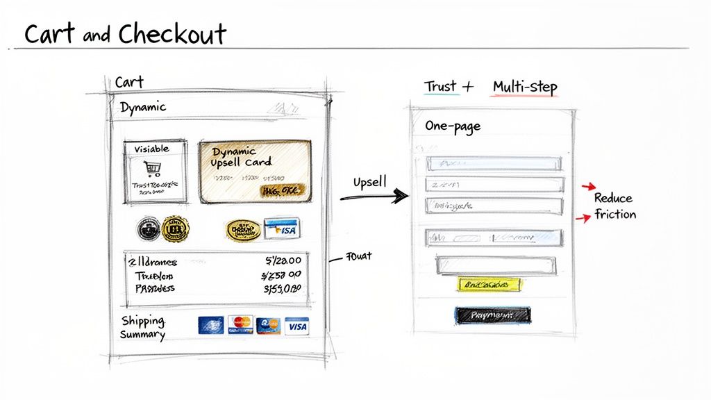
Engineering a High-Converting Cart Page
Think of the cart page as more than just a summary, it's your last chance to merchandise. The layout should build excitement and momentum, not stop it cold. It needs to be dead simple for shoppers to review their order and see the final cost, all while you present them with genuinely useful offers.
Forget the lazy "you might also like" widget. Your upsells should feel personal and intelligent, based on cart contents and the customer's identity.
- For a first-time buyer: Offer a small, high-margin add-on that makes sense. Someone buying a leather bag? Show them leather cleaner. This is an easy way to increase their first order and introduce them to another part of your product line.
- For a repeat customer: Acknowledge their loyalty. If they're buying a product they’ve purchased before, your layout should feature a bold "Subscribe & Save" option right in the cart. This is how you turn a one-off sale into reliable, recurring revenue.
Beyond smart offers, the cart layout must convey trust. Prominently display security badges, accepted payment method logos, and an easy-to-find link to your return policy. Any ambiguity here creates hesitation.
Designing a Frictionless Final Step: The Checkout
The moment a user hits "Checkout," your job is to get out of their way. Every extra field, unnecessary click, and slow page load introduces friction. The typical debate is single-page vs. multi-step checkout, and there's no single right answer. It depends on your products and your customers.
The average cart abandonment rate hovers just under 70%, with a complicated checkout process being a top culprit. Your checkout layout isn't just a form, it's the final gatekeeper to your revenue.
A multi-step checkout, often designed with an accordion-style layout or a progress bar, is excellent for gathering complex details without overwhelming the customer. It works well for high-ticket items or products requiring customization because it breaks the process into digestible steps (e.g., Shipping > Delivery Method > Payment).
A single-page checkout, on the other hand, is all about speed. It’s perfect for brands with many repeat buyers or those selling simpler, lower-priced goods. Customers just want to complete the purchase. The layout puts all required fields on one screen, minimizing clicks and load times.
Key Layout Elements for Checkout Optimization
Regardless of the format you choose, a few layout elements are essential for reducing abandonment and building trust.
- Guest Checkout: Make this the biggest, boldest option on the page. Forcing account creation is a known conversion killer. Research from the Baymard Institute shows this is responsible for as many as 24% of abandoned carts.
- Visual Progress Indicator: If you use a multi-step checkout, a simple progress bar (e.g., Step 1 of 3) is a must. It manages expectations and shows customers the finish line is near, which reduces anxiety.
- Clear Cost Breakdown: Be completely transparent. The layout must show the subtotal, shipping, taxes, and any discounts before you ask for payment information. Surprise fees are the #1 reason for cart abandonment.
- Multiple Payment Options: Display the logos for every payment method you accept, especially digital wallets like Shop Pay, Apple Pay, and PayPal. These express options are powerful because they pre-fill customer info, slashing friction.
For brands seeking even more granular control over these final, crucial pages, it can be worth exploring customized web checkout solutions that allow you to fine-tune the experience. The real secret, however, is to test relentlessly. Your goal is to remove every last bit of friction between your customer and a completed purchase.
Putting Your New Layout Strategy to the Test
A brilliant layout strategy is just a hypothesis until it's validated with real numbers. This is where most brands fail. They either get bogged down in development or launch major changes without a reliable way to measure the actual impact.
Let's walk through how to turn your layout ideas into documented revenue gains, specifically on Shopify Plus. The goal isn't to run a few random A/B tests. It's to build a robust, repeatable process that constantly refines your store's layout based on customer behavior.
Build Your Testing Roadmap First
Before writing a line of code or launching a single test, you need a roadmap. Randomly testing button colors is a waste of traffic and your team's time. A good roadmap prioritizes tests based on potential impact versus the effort required, ensuring you're always working on the biggest opportunities first.
A simple but effective method is the ICE scoring model (Impact, Confidence, Effort). For every test idea, assign a score from 1 to 10 in each category.
- Impact: How much revenue could this generate if it wins? Redesigning your entire PDP layout for a key segment will have a much higher impact score than tweaking a footer link.
- Confidence: How certain are you that this will work? A test backed by user research or analytics gets a high score. A pure guess gets a low one.
- Effort: How many hours will this take to build and launch? A quick headline change is a 1, while a dynamic, personalized collection page could be a 9 or 10.
Add Impact and Confidence, then divide by Effort. The ideas with the highest scores go to the top of your roadmap. This framework brings discipline to your optimization efforts.
Setting Up and Running Meaningful Tests
Once you have a prioritized roadmap, it's time to execute. Modern tools like Intelligems enable you to run sophisticated tests without needing a developer for every change. This is critical for testing layout variations for the customer segments you've defined.
For example, consider testing a new product grid on your collection pages. Instead of your standard 3-column grid, perhaps you want to test a 2-column layout with larger images and more prominent "Quick Add" buttons, but only for mobile users who came from a paid social ad. That is a much smarter test than a blanket change for all traffic.
Data supports this focus. Stores that optimize their grid layouts can see sales increase by up to 30% compared to a disorganized setup. Why? It makes it easier for people to shop. Analytics show that well-structured grids can lead to 15-20% faster checkout times, which often translates to larger carts. You can dig into more data on retail layouts (might give you some ideas for ecom as well) and how they shape customer behavior.
The goal is to move past testing isolated elements. Don't just test a button. Test a completely different PDP layout for first-time visitors versus a specialized layout for VIPs designed to showcase relevant cross-sells.
What to Measure and How to Read the Results
A "win" isn't just a higher conversion rate. For a serious ecommerce brand, your key performance indicators (KPIs) must be more sophisticated and tied directly to the bottom line.
Your testing dashboard should track both primary and secondary metrics.
| Metric Type | Example KPIs | Why It Matters |
|---|---|---|
| Primary KPI | Profit Per Visitor (PPV) | This is your north star. It combines conversion rate, AOV, and margins to show the true impact on profitability. |
| Secondary KPIs | Conversion Rate (CR) | The percentage of visitors who purchase. Essential, but it can be misleading if your average order value drops. |
| Average Order Value (AOV) | Tracks how much customers spend per order. A powerful lever for growing revenue without increasing traffic. | |
| Add-to-Cart Rate | Shows product interest, even if users don't complete checkout. It helps identify funnel leaks. |
When a test concludes, don't just look at the winner and move on. Dig into the secondary KPIs to understand why it won. Did the new layout boost AOV but slightly lower the conversion rate? That could still be a massive win for overall profit.
Every test, win or lose, provides an insight. That insight should feed directly back into your roadmap, informing your next test. This continuous loop of prioritizing, testing, and analyzing is what separates high-growth brands from the rest. It turns your store design from a static project into a living asset that constantly adapts to increase revenue.
Your Top Questions About Store Design & Layout
Even with a solid strategy, ecommerce leaders often have questions about practical application. Let's tackle the common ones: cost, timing, and how to measure success.
How Often Should I Change My Store Layout?
Abandon the idea of the massive, one-and-done redesign every few years. That model is obsolete. The real gains are in continuous, data-driven iteration and testing.
You should be analyzing your data and running layout tests on key pages for specific customer segments at least quarterly. Identify where users are dropping off or which segments are underperforming, these are your starting points.
A major architectural change might only be necessary every 2-3 years, typically driven by a rebrand, a significant business model pivot, or a platform migration. Otherwise, think evolution, not revolution. Small, steady improvements consistently outperform large, disruptive overhauls.
What's the Single Biggest Mistake I Could Make?
Designing for an imaginary "average user." This is the most expensive mistake you can make because that person doesn't exist. It ignores the diverse intents of your customers. A first-time visitor from a Meta ad has a completely different mindset than a loyal VIP customer logging in to see new arrivals.
A one-size-fits-all layout serves no one well and actively suppresses your profit per visitor. It’s the digital equivalent of giving every person who walks into a physical store the exact same sales pitch, regardless of what they’re looking for.
This approach leads to bland messaging, irrelevant product suggestions, and a clunky experience that sends high-intent visitors directly to your competitors.
Can I Improve My Layout Without a Full Redesign?
Yes, absolutely. In fact, you should. The most powerful store design strategies are built on iterative testing and personalization, not massive rebuilds. With modern tools, you can launch targeted experiences for different shoppers without needing a developer to edit your theme's code.
Here's where to start for the quickest wins:
- Focus on High-Traffic Pages: Don't try to change everything at once. Start with the pages that get the most traffic, like your best-selling collection pages or flagship PDPs.
- Zero In on Segments: Instead of changing the layout for everyone, test a new PDP layout with heavy social proof just for new visitors. Or try a different product grid on a collection page for returning customers.
- Test Modular Changes: You can experiment with personalized hero banners, dynamic recommendation blocks, or different filter placements without disrupting your entire site. These small, incremental gains add up significantly over time.
At CONVERTIBLES, we build and manage personalization programs for Shopify Plus brands, turning generic storefronts into conversion machines that speak directly to your different customer segments. Our process involves mapping your most valuable segments and aiming to ship 2-4 validated experiences every month to consistently lift your profit per visitor.