7 Actionable Resources for High-Converting Ecommerce Homepage Examples

[ SUMMARIZE WITH AI ]
[ FREE CRO TEARDOWN ]
Find the 3 biggest revenue leaks on your store.
Every day a conversion leak goes unfixed, you're paying for traffic that doesn't buy. Get a 5-minute Loom through your PDP, cart, and checkout, with mockups of the fixes. No pitch.
Get My TeardownYour homepage is your top salesperson, not a digital brochure. For a $3M-$200M ecommerce brand, a generic homepage bleeds profit. The standard playbook of a hero image, three value props, and a best-sellers grid is table stakes. To scale, you need a dynamic, segment-aware homepage that converts different visitors with different intents, especially high-cost traffic from paid ad campaigns.
This guide breaks down seven practitioner-approved resources for finding ecommerce homepage examples that go beyond aesthetics. We move past simple design inspiration and into strategic deconstruction. This is not a gallery of pretty pictures. Instead, it is a curated collection of high-quality examples, analyzing the conversion levers at play.
We will analyze the hero sections, navigation structures, social proof implementation, and offer presentations that drive action. More importantly, we'll identify the personalization opportunities and specific A/B tests your growth team can implement immediately. The strategies discussed here are deeply rooted in broader Conversion Rate Optimization best practices that apply across your entire site.
This resource is built for operators who want to turn their homepage into a revenue engine. Each section includes direct links to the source, so you can explore these high-performing designs yourself. Let's analyze the examples that will help you build a homepage that doesn't just look good, but actively sells.
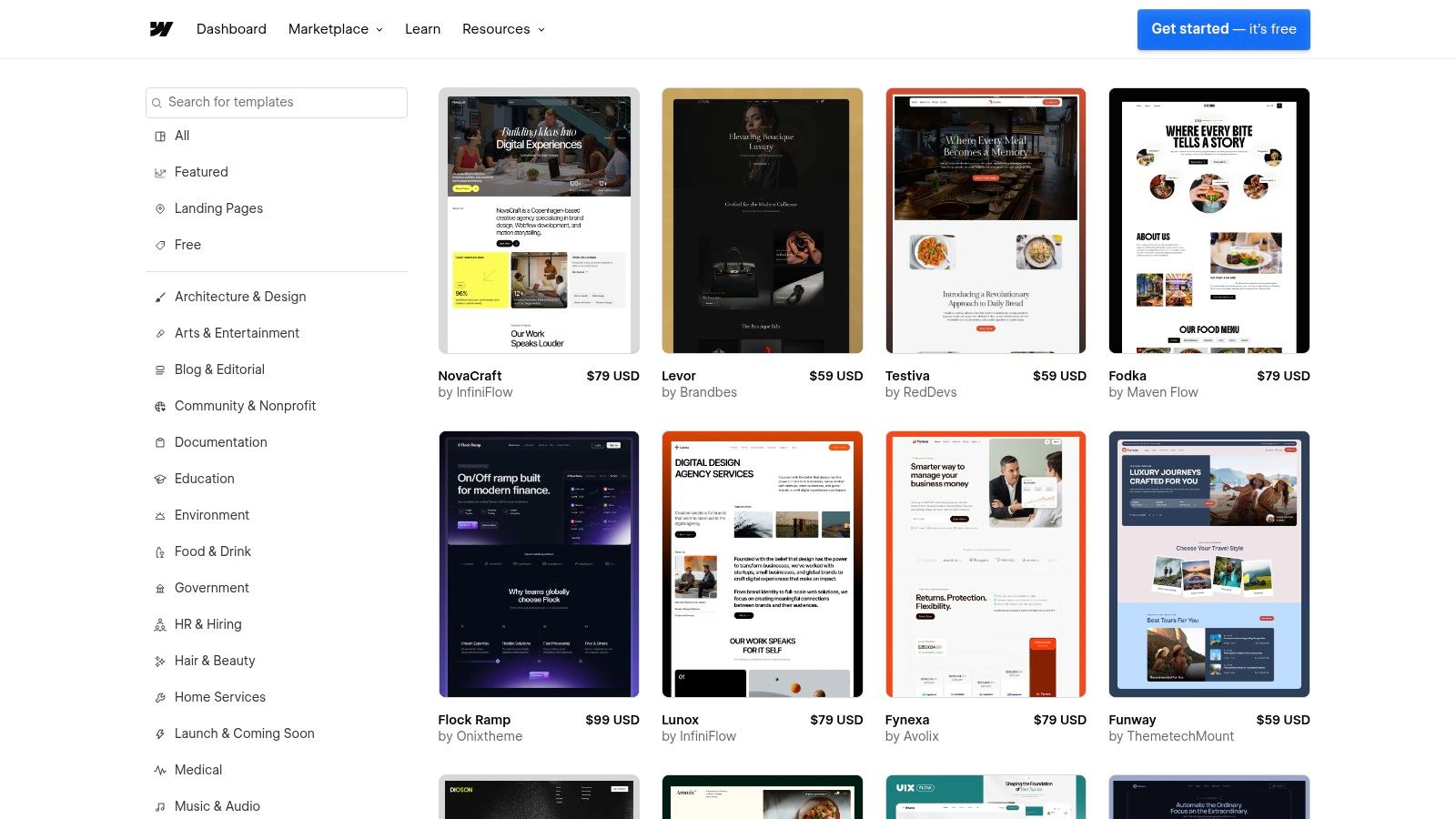
1. Shopify Theme Store
Instead of a single brand, we begin with the foundational source for thousands of high-converting ecommerce homepage examples: the Shopify Theme Store. It’s an official marketplace where Shopify and its partners publish proven, tested, and feature-rich themes. For growth-stage brands, this isn't just a place to buy a template; it's a strategic library of homepage structures that work.
Each theme offers a full, interactive demo store. This allows your team to see precisely how a top-tier homepage is structured before committing. You can analyze everything from the hero section layout and navigation to the social proof modules and product merchandising grids. It’s the perfect baseline for understanding what a high-performance homepage needs right out of the box.
Why It’s a Great Starting Point
The primary advantage is reliability and de-risking your development. Themes sold here are vetted by Shopify, ensuring they are compatible with the latest platform features, apps, and performance standards. This is critical for Shopify Plus brands that can't afford to deal with buggy, unsupported code.
The live demos serve as an invaluable research tool. You can dissect how successful themes handle common conversion levers:
- Hero Sections: See how different themes use full-width imagery, video, or split-screen layouts to present their core value proposition. You can even see how a simple copy change can impact this section. For more on this, check out our homepage banner copy test case study.
- Navigation: Analyze mega menus versus simple dropdowns and see how top themes promote key collections or offers directly in the header.
- Social Proof & UGC: Most modern themes have built-in sections for customer testimonials, Instagram feeds, and press logos, showing you best-practice placements.
Actionable Takeaways & Implementation
For Growth & Marketing Teams:
- Build a "Swipe File" of Components: Don't just look at whole themes. Use the live demos to screenshot specific homepage modules you like, such as a unique "Featured In" logo bar, an effective "Shop by Benefit" section, or a compelling email capture pop-up.
- Filter for Your Niche: Use the robust filters to see what homepage structures are popular for your specific industry (e.g., "Fashion") and catalog size ("Large"). This provides a competitive baseline for your own design.
- Test Drive Before Committing: Shopify allows you to install any paid theme in your store's back end and customize it with your own branding and products. You only pay when you decide to publish it, making it a zero-risk way to prototype a new homepage design.
While premium themes can cost a few hundred dollars, they provide a solid, performance-optimized foundation that saves thousands in custom development and CRO guesswork.
Website: https://themes.shopify.com/
2. ThemeForest (Envato)
ThemeForest is a massive marketplace that offers a broader, more platform-agnostic view of ecommerce homepage examples. While Shopify's store is curated, ThemeForest provides a sprawling library of themes for WooCommerce, Magento, Shopify, and even plain HTML. For growth teams, it's an excellent resource for competitive analysis and sourcing design inspiration outside of their immediate ecosystem.
Similar to Shopify, every theme includes a live preview, which functions as a fully interactive homepage demo. You can explore a vast range of design aesthetics, from minimalist and corporate to highly niche and experimental. This variety makes it a powerful tool for discovering new layout ideas or finding a cost-effective template if your brand operates on a platform like WooCommerce.
Why It’s a Great Starting Point
ThemeForest's primary advantage is its sheer volume and diversity, often at a lower price point than official marketplaces. You can see what design trends are popular across the entire ecommerce landscape, not just within a single platform's bubble. This is especially useful for brands looking to break from the standard Shopify look and feel.
The public sales data and user ratings offer a layer of social proof for each design:
- Broad Design Inspiration: See how top-selling themes for different platforms handle navigation, product grids, and calls to action. A popular WooCommerce theme might have a homepage module that could be adapted for your Shopify store.
- Feature Discovery: Many themes bundle premium plugins or unique features. Their homepages demonstrate these features in a live environment, giving you ideas for new functionality to add to your own site, like advanced product filtering or unique lookbook sections.
- Vetting and History: You can check a theme’s sales history, last update, and user comments. This helps you gauge the reliability and support level of the developer before committing, mitigating the risk of purchasing an outdated or unsupported template.
Actionable Takeaways & Implementation
For Growth & Marketing Teams:
- Conduct Cross-Platform Research: Before your next homepage redesign, spend an hour browsing the top-selling themes for other major platforms like WooCommerce. You will uncover layout patterns and conversion tactics your direct Shopify competitors might not be using.
- Vet Developers Thoroughly: Unlike official stores, quality can vary. Look for "Power Elite" authors, check the comments section for support-related feedback, and review the changelog to ensure the theme is actively maintained. This is a critical step to avoid technical debt.
- Use It for A/B Test Ideas: The live demos are a goldmine for A/B testing hypotheses. If you see a top-selling theme using a sticky "Add to Cart" bar on its homepage product carousels, that's a validated concept you can prototype and test on your own site.
While third-party themes require more due diligence, ThemeForest provides an unparalleled source of diverse homepage examples and cost-effective templates, making it an essential research stop for any ecommerce team.
Website: https://themeforest.net/
3. Webflow Templates
For brands pushing the boundaries of design and content, Webflow Templates offer a look into the future of ecommerce homepages. While not a direct Shopify theme, this marketplace is a goldmine for modern, interaction-heavy, and content-driven layouts. It’s the ideal resource for teams building a headless front-end or those who prioritize a rich, editorial-style brand experience over a standard product grid.
Similar to the Shopify Theme Store, every template includes a live demo. This lets your team interact with advanced animations, unique scroll-triggered events, and sophisticated layouts that are often too complex for traditional Shopify themes. It's the perfect place to find inspiration for a homepage that feels more like a digital flagship store than a simple catalog.
Why It’s a Great Starting Point
Webflow excels where traditional themes can feel restrictive: motion and interaction. For brands selling a high-consideration product or building a strong narrative, these templates show how to guide a user through a story, not just a sales funnel. They provide excellent ecommerce homepage examples for brands that want to stand out visually.
The live demos are invaluable for concepting and prototyping:
- Advanced Hero Sections: Explore homepages that use parallax scrolling, video backgrounds with text overlays, and multi-layered animations to create an immersive first impression.
- Content & Commerce Integration: See best-in-class examples of how to seamlessly blend editorial content (like blog posts or founder stories) with product modules and calls to action.
- Micro-interactions: Analyze how small animations on button hovers, image reveals, and menu transitions can significantly elevate the perceived quality and polish of your brand.
Actionable Takeaways & Implementation
For Growth & Marketing Teams:
- Prototype a Headless Front-End: Use a Webflow template to quickly build a high-fidelity prototype of a new homepage. You can connect this to a Shopify back-end using a headless architecture, getting the best of Webflow's design flexibility and Shopify's robust commerce engine.
- Isolate & Replicate Animations: Find a specific interaction you love, like a unique "add to cart" animation or a creative way product images load on scroll. Record it and use it as a detailed brief for your development team to implement on your current site.
- Test New Content Modules: The no-code editor makes it easy to experiment with new homepage sections. You can build and test a "Why We're Different" module or a "Behind the Scenes" block in Webflow before committing development resources to build it on your live Shopify site.
While using a Webflow template requires a more technical, often headless, setup, it's an unparalleled resource for brands wanting to create a truly differentiated and modern homepage experience.
Website: https://webflow.com/templates/ecommerce-website-templates
4. Awwwards
For brands aiming to position themselves at the premium end of the market, Awwwards serves as an essential gallery of cutting-edge web design and interaction. It’s a juried awards platform that recognizes the most innovative and artfully directed ecommerce experiences. This isn't a place for standard templates; it's a source of inspiration for creating a homepage that feels bespoke, immersive, and truly memorable.
While the Shopify Theme Store provides a foundation of proven conversion structures, Awwwards pushes the boundaries of what a homepage can be. It’s the ideal resource for teams looking to infuse their site with high-end motion, micro-interactions, and a strong sense of brand storytelling. The platform’s "Elements" library is particularly useful, allowing you to isolate and study specific UI patterns like product galleries, navigations, and footers from award-winning sites.
Why It’s a Great Source of Inspiration
The key benefit of Awwwards is its high-quality curation. The sites featured have been vetted by a panel of expert designers and developers for their creativity, content, and usability. This provides a benchmark for brands that want their digital presence to be as premium as their products.
It’s an unparalleled resource for studying advanced homepage techniques:
- Motion & Micro-interactions: See how leading brands use subtle animations on hover, page-load transitions, and scroll-triggered events to create a dynamic and engaging user experience.
- Art Direction & Photography: Analyze how top-tier sites integrate bold, unique photography and typography to build a powerful brand narrative directly on the homepage.
- Storytelling Modules: Discover how brands are moving beyond simple product grids to incorporate richer, more editorial-style content. For a deeper dive, explore our homepage storytelling module case study.
Actionable Takeaways & Implementation
For Growth & Marketing Teams:
- Isolate Specific UI Elements: Use the Awwwards "Elements" filter to find inspiration for a single component you want to improve, such as your navigation menu or a "Featured Products" section. Don't try to copy an entire site; instead, adapt a single innovative idea to your existing structure. (and test it)
- Brief Your Design Team with Visuals: When planning a homepage refresh, use examples from Awwwards to create a mood board. This gives your creative team a clear visual direction for the level of polish and interaction you're aiming for, avoiding generic design outcomes.
- Balance Creativity with Conversion: Many Awwwards sites are highly experimental. Your job is to extract the creative concepts and apply them to a conversion-focused framework. For example, take an innovative hover effect you find but apply it to a familiar, easy-to-navigate product grid on your homepage.
While many of the designs are custom-built, the principles they showcase can inspire high-impact A/B tests and elevate your brand's digital presence far above the standard template.
Website: https://www.awwwards.com/
5. Commerce Cream
Where the Shopify Theme Store provides the foundation, Commerce Cream showcases what’s possible when top-tier brands and agencies build upon it. It's a highly curated gallery of beautiful and effective DTC stores, with a strong focus on the Shopify ecosystem. For growth-stage teams, this is less about finding a template and more about strategic inspiration from live, in-production ecommerce homepage examples.
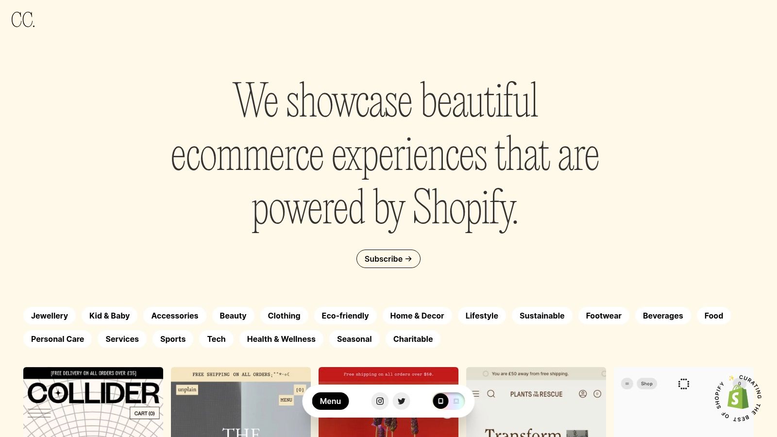
Unlike broad design galleries like Awwwards, Commerce Cream is laser-focused on actual commerce. Each example links directly to the live website, allowing you to move beyond static screenshots and analyze the full user journey. You can see how brands handle everything from animated hero sections and unique navigation patterns to interactive merchandising bands and social proof modules in a real-world context.
Why It’s a Great Starting Point
The primary advantage is its platform-specific relevance. Because the gallery heavily features Shopify stores, you can be confident that the designs and features you see are achievable within that ecosystem. This is critical for teams planning a redesign or looking for new homepage modules to A/B test, as it keeps inspiration grounded in technical reality.
The live site examples provide an unfiltered view of current DTC trends:
- Merchandising & Discovery: See how leading brands use "Shop the Look," "Best-Seller" carousels, and "Shop by Benefit" sections to guide users from the homepage to product pages.
- Social Proof & UGC: Identify emerging patterns in how brands display user-generated content, press mentions, and customer reviews to build immediate trust.
- Offers & Promotions: Analyze how different homepages present sitewide offers, free shipping thresholds, and email capture incentives without disrupting the brand aesthetic. For a deeper dive into optimizing these elements, you can explore ways to improve your ecommerce conversion rate.
Actionable Takeaways & Implementation
For Growth & Marketing Teams:
- Benchmark Competitor Aesthetics: Use the gallery to get a sense of the visual standard in your niche. Analyze how direct and indirect competitors use typography, color palettes, and photography to create a compelling brand experience.
- Deconstruct Homepage Flow: Instead of just looking at the design, map out the user flow. Click through a few examples and document the journey: What is the primary call to action? How many scrolls does it take to see social proof? Where do they position their value propositions?
- Identify "Component" Opportunities: Find specific modules you can adapt for your own homepage. This could be a unique approach to a testimonial slider, an engaging "Our Story" section, or a creative way to feature product bundles. Screenshot these and add them to your testing roadmap.
Commerce Cream is a free resource that serves as an essential ideation tool, helping your team see what’s currently working for the best brands on Shopify before you invest in design and development.
Website: https://commercecream.com/
6. Land-book
While theme stores provide functional frameworks, Land-book offers pure visual inspiration. It's a hand-picked design gallery showcasing some of the most aesthetically pleasing and modern websites on the internet. Its dedicated Ecommerce category is a goldmine for brands looking to break away from template-driven designs and explore contemporary visual trends.
Unlike platforms focused on functionality, Land-book's strength is its curation of cutting-edge aesthetics. For growth-stage brands, it’s an essential tool for understanding how high-end design, unique typography, and bold color palettes are being used to create memorable brand experiences. It helps your team answer the question, "How can we look different and more premium than our competitors?"
Why It’s a Great Starting Point
The main advantage of Land-book is speed and trend-spotting. In minutes, you can scan dozens of high-quality ecommerce homepage examples to get a feel for the current visual zeitgeist. This is invaluable during the early stages of a homepage redesign or brand refresh project.
It provides a quick, visual-first way to analyze specific design elements:
- Visual Hierarchy: See how different brands use size, color, and spacing to guide the user's eye from the value proposition to the primary call-to-action.
- Typography & Color: The platform's filters allow you to search for homepages using specific colors or font styles, making it easy to find examples that align with your brand's identity.
- Creative Layouts: Discover unconventional grid systems, unique image treatments, and innovative interaction designs that can make your homepage feel more dynamic and engaging.
Actionable Takeaways & Implementation
For Growth & Marketing Teams:
- Create a Mood Board for Your Redesign: Use Land-book's "collection" feature (requires a free account) to save examples that capture the look and feel you want for your next homepage. Share this with your design team or agency to provide clear visual direction, reducing ambiguity and revision cycles.
- Isolate Component-Level Ideas: Don't just look at the full page. Find specific treatments you admire, like a unique product hover state, an interesting footer layout, or a creative way to display customer reviews. Screenshot these to build a library of micro-inspirations.
- Analyze Your Niche's Visuals: Use the "Industry" filter to see what other brands in your vertical are doing. This helps you identify common design patterns you can either adopt or intentionally subvert to stand out in a crowded market.
Land-book is less about technical implementation and more about setting the creative vision. It’s the perfect resource for when your current homepage feels stale and you need fresh, high-quality ecommerce homepage examples to inspire your team.
Website: https://land-book.com/design/ecommerce
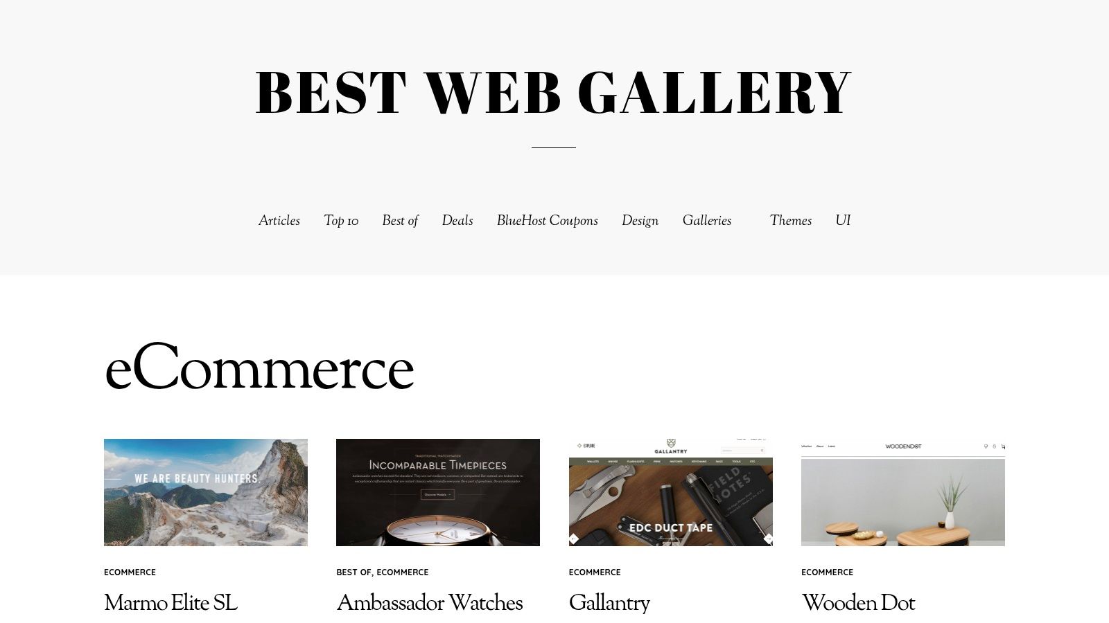
7. Best Website Gallery (BWG)
Best Website Gallery (BWG) is a long-standing, hand-curated showcase of web design. While not exclusively for ecommerce, its dedicated ecommerce category serves as a high-quality lookbook for brands seeking inspiration on visual direction, typography, and modern aesthetics. It's a screenshot-first gallery, designed for rapid visual assessment.
Unlike platforms focused on conversion deep-dives, BWG excels at providing top-of-funnel creative ideas. For a growth team in the early stages of a homepage redesign, it’s the perfect resource for building a mood board and exploring different art directions. You can quickly skim through hundreds of homepage examples to identify trends in hero section layouts, color palettes, and photography styles that align with your brand.
Why It’s a Great Starting Point
The primary advantage of BWG is its curated, design-first perspective. Every site featured has been hand-picked for its visual quality, making it a reliable source for aesthetic inspiration. It cuts through the noise of millions of live stores to show you only the ones that have achieved a high level of design execution. This is especially useful for premium and luxury brands where brand perception is paramount.
The platform's simplicity is its strength. It focuses purely on visual presentation, allowing your team to analyze:
- Art Direction & Photography: See how leading brands use product photography, lifestyle imagery, and unique visual treatments to create a compelling brand world right on the homepage.
- Typography & Layout: Quickly gather examples of effective font pairings, whitespace usage, and unconventional grid structures that help brands stand out.
- Above-the-Fold Composition: Because it’s screenshot-first, you immediately see how each site structures its most valuable real estate: the hero, navigation, and initial call to action.
Actionable Takeaways & Implementation
For Growth & Marketing Teams:
- Develop a Visual Mood Board: Use BWG as a starting point for any redesign project. Screenshot 10-15 homepage examples that capture the look and feel you're aiming for. This provides a clear, visual brief for your internal design team or external agency, preventing miscommunication.
- Identify "Breakout" Design Trends: Skim the ecommerce category to spot emerging trends in web design before they become mainstream. Are brands moving towards brutalist aesthetics, oversized typography, or more interactive, motion-based heroes? Use these insights to make your own site feel fresh and modern.
- Analyze Competitor Aesthetics: While it's not a direct competitive analysis tool, you can often find competitors or adjacent brands featured. Analyze their design choices to understand how they are positioning themselves visually in the market and identify opportunities for your brand to differentiate itself.
BWG is less about deconstructing CRO tactics and more about defining the creative vision for your homepage. It’s an essential, free resource for ensuring your brand’s visual identity is as strong as its conversion strategy.
Website: https://bestwebgallery.com/category/ecommerce/
7-Source Ecommerce Homepage Comparison
| Source | Implementation complexity | Resource requirements | Expected outcomes | Ideal use cases | Key advantages |
|---|---|---|---|---|---|
| Shopify Theme Store | Low: install & customize within Shopify | Shopify plan, basic theme customization skills; possible theme cost | Production-ready, Shopify‑compatible homepage templates | Teams on Shopify/Plus needing fast, reliable launches | High compatibility, live demos, official updates & support |
| ThemeForest (Envato) | Medium: varies by theme; may need dev fixes | Low-to-moderate budget; review seller support and code quality | Cost-effective templates across platforms with variable polish | Broad platform searches or niche aesthetic/budget builds | Huge variety, many niche options, lower entry price |
| Webflow Templates | Low-Medium: no‑code editing; integration required for platform ecommerce | Webflow account, designer for interactions, custom integration for Shopify/headless | Modern, animation-forward, editable templates (not direct Shopify themes) | Headless front-ends, CMS-driven stores, design-heavy prototypes | Strong motion/interaction tools and rapid no‑code prototyping |
| Awwwards | High: inspirational/examples require custom development | Design and dev resources; optional Creative Pass for courses | Cutting‑edge visual and interaction concepts (not turnkey) | Premium brand inspiration and advanced motion/UI ideas | Curated, high visual/interactivity quality and micro‑interaction examples |
| Commerce Cream | Low-Medium: examples are live Shopify sites to emulate | Shopify expertise, designer/dev time to rebuild patterns | Platform‑relevant, production DTC homepage patterns | DTC teams on Shopify wanting real-world benchmarks | Shopify-specific examples and practical merchandising patterns |
| Land‑book | High: visual inspiration needs translation into builds | Design resources to adapt trends; minimal platform context | Contemporary visual treatments and style direction | Rapid visual trend research and creative direction | Fast visual browsing, strong style/color/typography filters |
| Best Website Gallery (BWG) | High: screenshot-first inspiration requires custom implementation | Design/dev resources; limited functional/context notes | Quick look‑and‑feel references and historical homepage examples | Fast above‑the‑fold layout discovery and moodboarding | Lightweight, screenshot-focused browsing and broad archive of shipped sites |
Your Next Step: From Inspiration to Implementation
Inspiration without action is useless. You've reviewed resources for strong ecommerce homepage examples, but the real value comes from translating these observations into measurable profit. The common thread among all top-tier homepages is a deep understanding of the customer journey. They build a system of experiences tailored to different visitor segments. The message shown to a first-time visitor from a Meta ad should be different from the one shown to a loyal customer. A one-size-fits-all homepage fails to speak directly to anyone.
Key Takeaways to Action Now
Before you start building, distill the insights from this article into a concrete plan. The most successful teams don't just copy what works for others; they adapt the underlying principles to their unique audience and business model.
- Segment Before You Build: The most critical failure point is applying a brilliant idea to the wrong audience. Before you change a single pixel, map your key visitor segments. At a minimum, consider: first-time vs. returning visitors, traffic source (e.g., paid social, organic search, email), and purchase history.
- Prioritize Above the Fold: Your hero section and navigation are your most valuable real estate. This is where you must establish brand credibility, communicate your core value proposition, and guide users toward a primary action. Test your headlines and CTAs relentlessly.
- Build Trust with Social Proof: Customer reviews, user-generated content (UGC), and media mentions are not just "nice to haves." They are essential trust signals that directly address purchase anxiety. Integrate them strategically near key decision points. According to one study, 93% of consumers say that online reviews influenced their purchase decisions.
- Continuity is Conversion: Ensure a seamless transition from your ads to your homepage. If a user clicks an ad for a specific product or offer, that exact message must be reinforced the moment they land on your site. This continuity dramatically reduces bounce rates and increases conversion.
Turning Ideas into Profitable Experiences
The tools and platforms we've reviewed, from the Shopify Theme Store to curated galleries like Commerce Cream, provide a fantastic starting point. They offer the structural foundation and creative spark you need. To further fuel your design thinking and discover innovative layouts for your next project, delve into a curated collection of top examples of good design for a broader perspective on digital creativity.
However, the template is just the beginning. The real growth engine is systematic testing and personalization. Your goal is to move from a static homepage to a dynamic one that intelligently adapts to each visitor. Start small. Pick your highest-value segment, perhaps first-time visitors from your top-performing ad campaign, and build a dedicated homepage experience just for them. Measure the impact on conversion rate and average order value, then scale the winners. This iterative process is how you build a truly optimized ecommerce machine.
Frequently Asked Questions
What makes a high-converting ecommerce homepage?
Three elements matter most: a hero section that matches visitor intent by segment, strategic social proof placement above the fold, and clear navigation that reduces decision fatigue. The biggest mistake is designing one static homepage for all visitors instead of personalizing for different segments.
Should I redesign my homepage all at once or test incrementally?
Test incrementally. Start with above-the-fold elements like the hero section, headline, and primary CTA since these have the highest impact on bounce rate. Use inspiration from design galleries for direction, but validate every change with an A/B test measuring revenue per visitor.
How important is homepage design for SEO?
Homepage design indirectly impacts SEO through user engagement signals. Fast load times, mobile responsiveness, and clear navigation reduce bounce rate and increase time on site. However, the homepage is primarily a conversion tool. Focus SEO efforts on collection and blog pages with higher search intent.
Where should I look for homepage design inspiration?
Commerce Cream curates real Shopify DTC stores in production. Awwwards showcases award-winning designs pushing creative boundaries. The Shopify Theme Store lets you install and preview themes before paying. Study patterns across multiple sources rather than copying a single competitor.
We work on tactics like these daily, book a call to get 3 custom (tailored for your business), researched personalization ideas to get you started.