High-Converting Ecommerce Landing Pages That Drive Profit

[ SUMMARIZE WITH AI ]
[ FREE CRO TEARDOWN ]
Find the 3 biggest revenue leaks on your store.
Every day a conversion leak goes unfixed, you're paying for traffic that doesn't buy. Get a 5-minute Loom through your PDP, cart, and checkout, with mockups of the fixes. No pitch.
Get My TeardownIf you're spending on Meta or Google Ads only to send traffic to a generic product page, you are burning cash. This one-size-fits-all approach creates a jarring disconnect between your ad and your site, killing your conversion potential and bleeding your marketing budget dry.
The solution is building dedicated e-commerce landing pages designed and personalized for your most valuable customer segments.
Why Your Current Ecommerce Landing Pages Are Leaking Money
For most growing ecommerce brands, the biggest silent killer of profit is a broken user journey. You spend a fortune crafting the perfect ad, targeting a specific audience with a specific message. But when they click, they land on a generic page that speaks to everyone, which means it speaks to no one.
This is a failure of ad-to-site continuity.
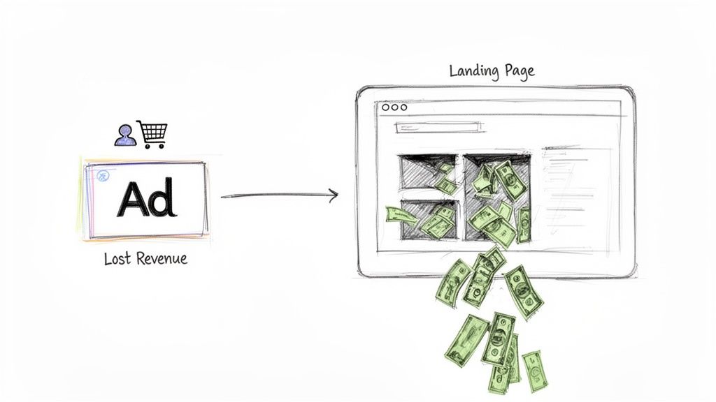
That disconnect forces potential customers to reorient themselves, figure out where to go, and hunt for the product that caught their eye. Most won't bother. They'll bounce, and you're left paying for a click that went nowhere.
The Real Cost of a Generic Approach
This isn't a minor UX issue, it's a direct hit to your bottom line. While the average ecommerce landing page conversion rate sits around 2.5%–3%, for Shopify stores, that number drops to 1.4%–1.8%, according to 2024-2025 data from Littledata and Shopify's own benchmarks.
An optimized page, on the other hand, can hit closer to 8%-10%. That’s a massive opportunity gap you cannot afford to ignore.
The problem is that generic pages don't acknowledge why a visitor is there. A first-time shopper from a TikTok ad needs a completely different experience than a loyal customer clicking an email about a new product drop.
When you treat them the same, you get high bounce rates and wasted ad spend. The lack of tailored messaging makes your site feel irrelevant, sending high-intent visitors straight to competitors who offer a smoother, more coherent experience.
Generic vs Personalized Landing Page Performance
To put this in perspective, let's compare the results of a generic page against a targeted approach. The difference is stark.
| Metric | Generic Landing Page (Industry Average) | Personalized Landing Page (Potential) |
|---|---|---|
| Conversion Rate | 1-2% | 5-10%+ |
| Bounce Rate | 60-90% | 25-40% |
| Return on Ad Spend (ROAS) | 1-2x | 4-8x+ |
| User Experience | Confusing, high-friction | Seamless, relevant |
Personalization isn't a "nice-to-have." It directly impacts the metrics that determine whether your ad campaigns are profitable or a money pit.
Moving From a Leaky Funnel to a Revenue Driver
Every visitor who bounces because of a mismatched experience represents lost revenue and a squandered customer acquisition cost. Fixing this isn't about changing button colors, it's about fundamentally rethinking how you greet traffic from different channels. Another reason landing pages could perform better is improved search engine visibility, so applying solid ecommerce SEO best practices is a critical part of stemming these losses.
Personalization is how you plug the leaks. By creating landing pages for specific segments, you can:
- Maintain Message Match: The headline, images, and offer on your page must mirror the ad they just clicked. No surprises.
- Reduce Friction: Give them the exact product or deal you promised, without making them hunt for it.
- Increase Relevance: Speak directly to their pain points, motivations, and existing knowledge of your brand.
This strategic alignment transforms your funnel from a leaky bucket into an efficient revenue machine. For more strategies, see our complete guide on how to improve your ecommerce conversion rate.
Finding Your Most Profitable Customer Segments
High-converting e-commerce landing pages are never built for a general audience, they're precision engineered for a specific user. If you try to talk to everyone, you connect with no one. The first move is to stop thinking about your audience as one group and start breaking it down into valuable segments.
This goes beyond basic demographics like age or location. You need to understand psychographics, buying intent, and where they are in their journey with your brand. The goal is to build sharp, detailed profiles that guide every landing page decision, from the headline to the CTA button.
Mine Your Existing Data for Insights
You don't need expensive new tools to get started. The insights you need are already in your ad platforms and ecommerce backend. By digging into this information, you can spot the patterns that define your best customers and start creating targeted experiences.
Here is where to start looking:
- Meta Ads Manager: Look at performance by placement. Are users converting from Instagram Stories or the Facebook Feed? A user clicking from a dynamic video ad on their phone has a different mindset than someone clicking a static image ad on a desktop.
- Google Ads: Dive into your Search campaigns. What keywords are users typing? Are they searching for broad terms like "running shoes" or specific models like "Nike Pegasus 41"? This reveals their intent and product knowledge.
- Shopify Backend: Your sales data is a goldmine. Use it to build segments based on purchase history, average order value (AOV), and products people buy together. This is how you find your VIPs, discount shoppers, and customers loyal to a specific category.
When you identify these segments, you can shift from a one-size-fits-all approach to a one-to-one conversation. You stop shouting into a crowd and start delivering the right message to the right person.
From Broad Demographics to Actionable Segments
After you have pulled the data, you can build meaningful customer segments. The key is to make them specific enough to be actionable. Vague labels like "millennial shoppers" are useless. Focus on behavior and intent.
For example, a fast-growing apparel brand could identify three distinct, high-value segments:
- First-Time Discount Shoppers: These users almost always come from paid social ads pushing a "20% Off Your First Order" offer. They are price sensitive, don't know the brand well, and need social proof and a clear value proposition. Their landing page must instantly validate the discount they clicked.
- Repeat High-Value Buyers: This segment comes from the email list and has a high AOV. They are loyal, trust the brand, and are excited about new arrivals. Their landing page shouldn't waste time with introductory offers, it should focus on exclusivity, new products, and loyalty perks.
- Mobile Instagram Story Responders: These visitors swipe up directly from an influencer's story. They are highly visual, often buying on impulse, and have short attention spans. For them, the landing page must be mobile-first, load instantly, and put the exact product from the story front and center with a simple path to checkout.
This is the kind of segmentation that effective personalization is built on. Once you understand who you're talking to, you can build ecommerce landing pages that meet their needs, answer their questions, and guide them smoothly toward a purchase. This is the repeatable process that separates brands that scale profitably from those that burn through ad spend.
Designing Landing Pages That Convert
Now that you know who you're talking to, it's time to build an experience that drives action.
Effective design for e-commerce landing pages is not about winning awards. It is about ruthlessly eliminating friction and guiding the user toward a single, profitable action. For any brand serious about growth, this means balancing a strong brand identity with an unapologetic focus on conversion.
First, forget standard website design. A landing page is a specialist tool, not a jack of all trades homepage. Its only job is to convert traffic from a specific campaign, and every element must serve that one goal. This requires a disciplined approach.
The Power of a Single, Unwavering Focus
The single biggest mistake brands make is giving visitors too many choices. A cluttered page with multiple CTAs, a full navigation bar, and links to social media is a conversion killer. It creates decision paralysis and invites users to wander off before completing the purchase.
The solution? Be relentlessly single-minded.
Get rid of the main navigation menu. Ditch the footer links. Your landing page should have one clear path forward, guided by one prominent call-to-action. That’s it.
This focused approach can have a massive impact. Simply removing navigation elements from a landing page can double conversion rates in A/B tests. It’s a simple change that removes distractions and forces the visitor to engage with the offer.
This isn't just a small tweak, it is a fundamental strategy shift that produces dramatic results.
Engineer Trust and Urgency
With a focused layout, your next job is to build trust and give the user a compelling reason to act now. This is about the strategic placement of psychological triggers, proven methods for easing customer anxiety and motivating action.
Incorporate these elements into your design:
- Social Proof: Don't just say your product is great, show it. Feature authentic customer reviews (with photos!), user-generated content, star ratings, and press logos. Place these near your CTA to build confidence at the critical moment.
- Risk Reversal: Customers are naturally skeptical. Tackle objections head on with strong guarantees, a clear return policy, and trust badges like secure payment icons. Make the purchase feel like a safe bet.
- Urgency and Scarcity: Limited-time offers, countdown timers, and low stock indicators create a powerful fear of missing out (FOMO). This is potent for campaign specific landing pages tied to a sale or limited product drop.
These elements work together to lower anxiety and increase motivation, pushing hesitant buyers over the finish line.
Mobile-First, Always. No Excuses.
Over 60% of website traffic now comes from mobile devices. For social driven ecommerce brands, that number is often closer to 80%. You must design for the smallest screen first. A mobile-first approach ensures your page is scannable, loads fast, and is easy to navigate with a thumb.
Think about the user experience on a phone:
- Large, Tappable Buttons: Make your CTAs big and place them in easy to reach spots.
- Collapsible Sections: Use accordions to tuck away less critical information like FAQs or shipping details, keeping the page clean.
- Vertical Imagery: Use images and videos optimized for a vertical screen to maximize impact.
Page speed is another critical factor. According to research from Portent, pages that load in one second have conversion rates 3x higher than pages that load in five seconds. To dig deeper into boosting performance, explore these conversion rate optimization best practices. Speed isn't just a technical detail, it's a core component of a high-converting design.
Writing Offers and Messaging That Convert
Once you have mapped out your audience and design, focus on what you're actually saying. This is about moving from a clean layout to persuasive copy that speaks directly to your ideal customer. It is not about being clever, it is about creating a smooth, trust building journey from the ad to the page.
The single most important rule is message match. The promise you make in your ad must be the first thing a visitor sees on your landing page. If your Facebook ad screams "50% Off Flash Sale," your landing page headline cannot be a quiet "Shop Our New Arrivals."
This connection is everything. A seamless transition between the ad and the page instantly tells visitors they're in the right place, building trust from the first second. A mismatch is the fastest way to lose a customer and waste ad spend.
Headlines That Hook, Not Confuse
Your headline is your first and perhaps only shot to grab attention. Its purpose is to make them want to read the next line. Forget witty one-liners and focus on being clear and compelling.
A great headline is always benefit driven. It must answer the visitor's unspoken question: "What's in it for me?" Instead of listing what your product is, show them what it does for them.
- Feature-focused: "Our jackets are waterproof." (Tells me what it is.)
- Benefit-focused: "Stay Dry on Your Commute, No Matter the Weather." (Tells me how it solves my problem.)
This simple shift from features to benefits reframes the conversation. You are no longer selling an object, you're selling a better version of their life.
Tailoring Your Offers for Different Segments
A generic "10% Off" coupon for every visitor is lazy marketing. The best offers feel like they were made for the person seeing them, matching their context and journey with your brand.
Consider these examples:
- For someone from a TikTok ad: They are likely new and need a strong nudge. An aggressive offer like "25% Off Your First Order + Free Shipping" works well to break down the initial barrier.
- For your loyal VIPs from an email: They already love you. A discount might feel cheap. Instead, reward their loyalty with something special, like "Early Access to Our New Collection" or a "Free Gift with Your Purchase."
The goal is to match the offer's value to the visitor's intent. A person who searched for your exact product might not need a huge discount, but a cold prospect from a social ad almost certainly does.
Body Copy That Builds Confidence
Your headline and offer got their attention. Now, your body copy has to close the deal. This is your chance to dig into the benefits, handle objections, and build proof that you are the real deal.
No one wants to read a wall of text. Keep paragraphs short, two or three sentences max. Break up copy with bolded keywords and easy to scan bullet points that highlight the most important benefits.
This is also the perfect spot for social proof. Weave in customer testimonials or star ratings next to your key claims. Seeing what real people say reinforces everything you're telling them, making it easier for a first-time visitor to trust you.
Finally, every word on your e-commerce landing pages should lead to a single, unmissable call-to-action (CTA). Your CTA button needs to be clear, action-oriented, and stand out visually. Use strong, benefit driven verbs like "Get My 25% Off" or "Shop The Exclusive Collection" instead of a weak "Learn More." Make it impossible not to click.
Building Your Personalization and Testing System
This is where strategy becomes a repeatable, profit-driving machine. An effective e‑commerce landing pages program is not about one-off wins. It is about building a system for constant, iterative improvement.
The goal is to get beyond simple A/B tests like changing button colors. We're talking about running high-impact experiments that create a real, measurable lift in revenue. This means personalizing headlines, offers, and even entire page layouts for your most valuable customer segments.
It is a disciplined process: launch, measure, learn, and repeat. When you get this right, you create a powerful flywheel effect where every successful experiment feeds the next, making your entire program smarter and more profitable.
This diagram breaks down the basic flow from the ad click to the conversion. It is the foundation of any solid testing program.
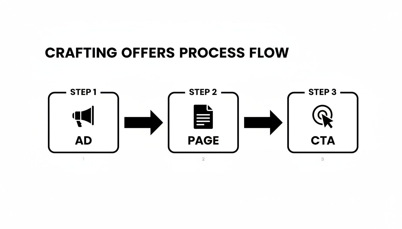
As you can see, perfect continuity is key. The message must be seamless from the ad creative right through to the final call to action.
Moving Beyond Simple A/B Testing
Standard A/B testing is a decent starting point, but for ambitious brands, it is not enough. Testing a green button versus a red one might give you a small bump, but it will not fundamentally change your business.
Real growth comes from personalization, where you test entirely different experiences for different audiences.
For instance, instead of testing one headline for all your traffic, you should be testing variations like this:
- Headline A: Focus on a 20% discount for your price sensitive, first-time buyers from Meta ads.
- Headline B: Highlight "New Arrivals" for your loyal, repeat customers from your email list.
- Headline C: Emphasize "Free Shipping" for visitors who previously abandoned their carts.
This is where you find real leverage. You shift from optimizing a single page to optimizing an entire customer journey. By consistently shipping two to four of these personalized experiences monthly, you can generate predictable, significant revenue growth. Our guide on what website personalization is is a great place to start.
The core idea is that optimization is not a one-time project, it is a core business function. It should be a constant, iterative process baked into your marketing operations.
The Essential Toolkit for Personalization
To run a serious testing program, you need the right tools. The key is finding a platform that handles both robust A/B testing and deep audience segmentation. Your stack needs to let you target users based on their traffic source, purchase history, device, and on-site behavior.
Your toolkit should include:
- An A/B Testing & Personalization Platform: Tools like VWO or specialized Shopify apps like Intelligems are non-negotiable. They let you create and launch different page variations without always involving your developers.
- Analytics and Heatmapping Software: I cannot overstate the value of tools like Hotjar, Heatmap, or Microsoft Clarity. They provide qualitative data, showing you how users interact with your pages, where they click, how far they scroll, and where they get stuck. This is gold for generating new test ideas.
- A Centralized Project Management System: Whether it's our own TestBuddy, Asana, Monday.com, or a spreadsheet, you need a single source of truth to manage your testing roadmap. This is where you track hypotheses, test results, and future experiments.
The financial return on this systematic approach is well documented. According to a VWO report, personalization can lead to an average conversion lift of 19%. What's more, a HubSpot study found that companies see a 55% increase in leads when they increase their number of landing pages from 10 to 15, proving that more targeted pages create compounding gains.
Designing Valid Tests for Clean Data
A test is only as good as the data it produces. To ensure your results are reliable and not random noise, you must be disciplined about how you design and run experiments. A poorly designed test is worse than no test at all because it can lead to confident but wrong business decisions.
Here is a simple framework to follow:
- Formulate a Clear Hypothesis: Every test must start with a solid hypothesis. Use this format: "By changing [X] for [Y segment], we expect [Z outcome] because [reason]." For example: "By personalizing the headline to match the ad's offer for our TikTok traffic, we expect to decrease bounce rate by 15% because it will improve message match."
- Ensure Statistical Significance: Do not call a test early. Use a sample size calculator to determine how much traffic you need to reach statistical significance (usually 95% or higher). Ending a test just because the numbers look good after a day is a classic mistake that leads to false positives.
- Isolate Your Variables: In a simple A/B test, only change one major element at a time. If you change the headline, the image, and the CTA all at once, you will have no idea which change caused the lift. To test multiple changes, use a multivariate test.
By sticking to this discipline, you will build a library of validated learnings about what truly motivates your different customer segments. That knowledge becomes a powerful competitive advantage that drives sustainable, long term growth.
Common Questions About Ecommerce Landing Pages
Even with the best strategy, practical questions always come up when you are building out a personalization program. Let’s address some of the most common ones from ecommerce leaders.
How Many Landing Pages Should My Ecommerce Store Have?
There is not one perfect number, but the data points in a clear direction: more is almost always better. Research shows that brands with over 40 landing pages drive significantly more conversions than those with just a handful.
But do not get hung up on a specific number. The goal is to build a system that lets you create new pages programmatically.
A great place to start is by creating a unique, personalized landing page for each of your major marketing campaigns and most valuable customer segments. Instead of one generic page, think about creating dedicated pages for your top 3-5 paid ad campaigns. This is how you nail message match and keep the experience seamless.
What KPIs Should I Track For My Ecommerce Landing Pages?
Your main conversion rate is important, but it is just one piece of the puzzle. To understand what's working, you need to look at a few other key metrics that tell the whole story.
- Bounce Rate: Think of this as your instant feedback loop. If users hit your page and immediately leave, there is a good chance your ad and page are not aligned.
- Average Time on Page: This measures engagement. Are people sticking around to read your copy? If they are gone in seconds, your offer or headline is not grabbing them.
- Cost Per Acquisition (CPA): This connects the dots on profitability. It tells you exactly how much you are spending to get a new customer from that specific page and campaign.
- Revenue Per Visitor (RPV): This is a powerful metric for figuring out the true value of your traffic. It helps you quickly spot your most profitable audience segments.
Track these KPIs for each audience segment. That is how you find your hidden gems and optimize ad spend for the highest return.
Should I Use A Template Or Build A Custom Landing Page?
For most brands on Shopify Plus, a hybrid approach offers the best of both worlds: speed and performance.
We typically recommend starting with a well-designed, conversion focused template from a page builder that allows for plenty of customization. This saves significant development time.
From there, you can use that template as a flexible foundation to create unique variations for different campaigns and customer segments. The key is to choose a tool that does not lock you into a rigid structure. You need the freedom to A/B test everything, from layout and headlines to offers.
You are not just building a page, you are building a system for continuous improvement. The right foundation lets you test, learn, and iterate fast, which is how you get compounding gains across all your e-commerce landing pages.
Ready to stop wasting ad spend on generic experiences? CONVERTIBLES helps Shopify Plus brands design and implement high-impact personalization programs that increase profit per visitor. See how we can build a system of compounding wins for your brand, get in touch.