How to Architect a Profitable E-commerce Customer Journey (2026)

[ SUMMARIZE WITH AI ]
[ FREE CRO TEARDOWN ]
Find the 3 biggest revenue leaks on your store.
Every day a conversion leak goes unfixed, you're paying for traffic that doesn't buy. Get a 5-minute Loom through your PDP, cart, and checkout, with mockups of the fixes. No pitch.
Get My TeardownA profitable e-commerce customer journey treats every visitor segment differently, matching the on-site experience to their source, intent, and purchase history so each touchpoint moves them closer to buying. If your Shopify Plus store shows the same homepage, the same popups, and the same product grid to a first-time TikTok visitor and a loyal VIP, you are leaving serious money on the table. This one-size-fits-all approach is a primary reason conversion rates stall and profit per visitor flatlines.
The fix is segment-driven personalization: building multiple dynamic pathways through your store, each engineered for a specific shopper profile. According to McKinsey's Next in Personalization report, 71% of consumers expect personalized interactions, and 76% get frustrated when they don't find them. That frustration translates directly into lost revenue for brands still running a single, static experience.
This guide breaks down exactly how to map, segment, and personalize your customer journey, with real A/B test results from 8-figure Shopify brands showing the revenue impact of each tactic.
Why a Generic Customer Journey Is Costing You Revenue
Most e-commerce stores operate on a flawed assumption: that all traffic is equal. They force every visitor down one static path, regardless of source, device, or purchase history. This isn't just inefficient, it actively injects friction at the most critical moments of the buying process.
Consider this common scenario. A potential customer clicks a hyper-specific Google Ad for "vegan leather tote bags." They expect to land on a page showcasing exactly that. Instead, they get dumped on a generic homepage pushing best-sellers or a sitewide sale, forcing them to restart their search. That disconnect between ad and landing page is a direct cause of high bounce rates and wasted ad spend.
The Problem with One-Size-Fits-All CRO
Traditional conversion rate optimization often focuses on broad, site-wide tweaks like testing a button color. While these tests have a place, they completely miss the bigger picture: your customer segments are fundamentally different. A 20% off coupon that converts a bargain hunter might devalue your brand in the eyes of a luxury buyer.
This plays out in ways most brands don't expect. At Convertibles, we've seen the same offer type, a welcome discount for new visitors, produce completely different results depending on the audience. A dollar-off threshold works for one product category while a free gift outperforms every discount variation in another. The tactic isn't the variable. The segment is.
A poorly optimized e-commerce customer journey is a silent revenue killer. Every friction point pushes customers closer to competitors. The solution isn't more generic tests. It's building a personalization system that adapts to who is actually browsing.
This is where personalization becomes a superpower for high-growth brands. Instead of one rigid path, a modern customer journey e-commerce strategy creates multiple dynamic pathways:
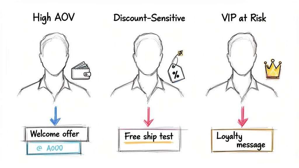
- For New Visitors: Greet them with a welcome offer that aligns with their acquisition channel and clearly states your unique value proposition.
- For Returning Customers: Surface product recommendations based on their previous browsing and purchase history.
- For VIPs: Grant exclusive access to new products or a simple acknowledgment of their loyalty.
Mapping Your Customer Journey by Segment
Mapping the customer journey is not an abstract marketing exercise. It's a tactical necessity. For brands investing heavily in paid media, each stage is a critical handoff where you either capture profit or lose a customer. The key difference between a useful journey map and a decorative one: mapping by segment, not just by stage.
Here is how to build a journey map that actually drives your testing roadmap.
Step 1: Define Your Core Segments
Before mapping any journey stages, identify the 3-5 customer segments that matter most to your business. These should be based on behavioral data, not just demographics. Strong customer segmentation strategies are the foundation of every effective personalization program.
For most Shopify Plus brands, these segments deliver the highest ROI when personalized:
- High-intent new visitors from paid ads (specific keyword or product interest)
- Returning browsers who haven't purchased (warm but unconverted)
- First-time buyers (need post-purchase nurturing)
- Repeat customers (cross-sell and upsell candidates)
- VIPs at risk of churn (high LTV, inactive 60-90 days)
Step 2: Map Each Stage for Each Segment
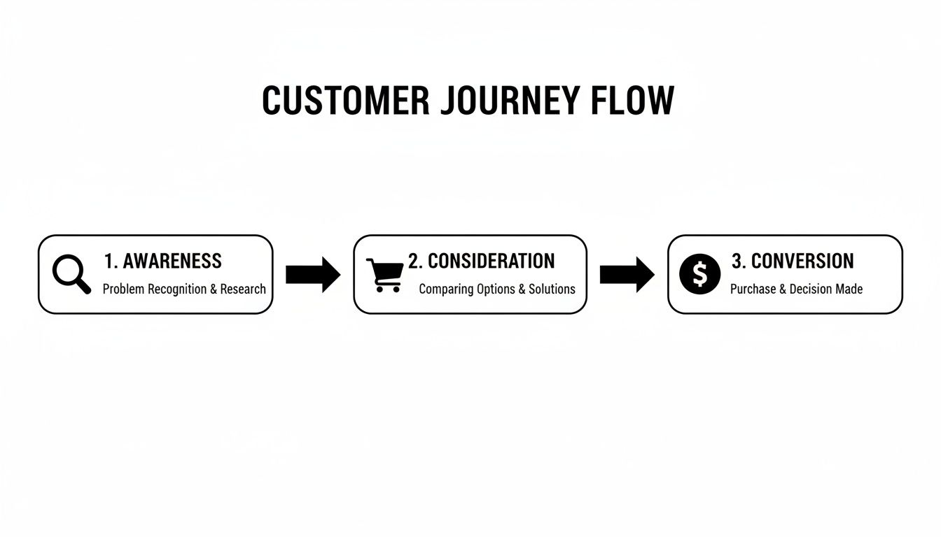
Now map the five journey stages, but do it separately for each segment. The stages are the same (awareness, consideration, conversion, retention, advocacy), but what happens at each stage differs completely by segment.
Awareness: This is where a person discovers your brand. For paid social visitors, it's the ad-to-landing-page handoff. For organic visitors, it's the search result to the blog or collection page. The most common mistake is a jarring disconnect between the promise (your ad or search snippet) and the delivery (your landing page). Ad-to-site continuity is non-negotiable for maximizing ROAS.
Consideration: The shopper is browsing and evaluating. This phase is prime for personalization. Instead of showing every visitor the same generic best-sellers, you tailor what they see based on their segment. Show a "Why Us" section or brand story to first-timers. Greet returning visitors with "New Arrivals" based on past browsing behavior. The goal is to make the shopper feel understood by surfacing what's relevant to their intent, not forcing them to dig through a generic catalog.
Conversion: The moment of purchase. Eliminate every ounce of friction here. Deploy segment-specific offers: a "15% Off Your First Order" banner for new visitors only, hidden from returning customers who are less price-sensitive. This protects your margins while still nudging new shoppers. Getting these mechanics right is the key to building effective e-commerce sales funnels.
Retention: Convert one-time buyers into repeat customers through personalized post-purchase flows. Send care instructions for the exact product they bought. Follow up with a cross-sell campaign featuring related items. The goal is to stay top-of-mind and increase customer lifetime value.
Advocacy: Turn loyal customers into brand evangelists. Implement a referral program that rewards both the advocate and the new customer. Request reviews in exchange for a discount on their next order. These advocates create social proof that feeds the top of your funnel, creating a self-sustaining growth loop.
Step 3: Identify the Gaps
With your segment-by-stage map complete, look for the friction points. Where do specific segments drop off? Where is the experience generic when it should be tailored? Those gaps become your testing roadmap. Prioritize tests that serve your highest-value segments first.
High-Impact Personalization Tactics (with Real Test Data)
The days of one-size-fits-all conversion optimization are over. Real growth comes from segment-driven personalization: showing the right experience, to the right person, at the right time. Think of it as the difference between shouting one message at a crowd and whispering the perfect offer to an individual shopper who is ready to buy.
Tactic 1: Segment-Specific Welcome Offers
Stop showing every visitor the same "10% off your first order" popup. Different segments respond to different incentive structures.
Our test data from Convertibles proves this. For an 8-figure wellness brand, we tested four popup variations. The winner was a $30-off offer with a $150 minimum threshold, which lifted email capture by 43% and AOV by 21%, generating $45,000/month in additional revenue. The key insight: concrete dollar amounts outperform percentages because "$30 off" requires zero mental math, while "15% off" forces shoppers to calculate.
But for an 8-figure pet brand, the same approach didn't win. Instead, a three-item free gift bundle crushed every discount variation, generating $60,000/month with a 25% AOV lift and 26% more email captures. Free gifts beat discounts because tangible, visualizable rewards outperform abstract percentage savings, particularly for emotionally driven purchases.
The takeaway: Your welcome offer strategy must be tested per segment and per product category. What works for wellness shoppers won't work for pet owners.
Tactic 2: Homepage Personalization by Visitor Type
Your homepage is your most valuable real estate. Stop showing every visitor the same banners and collections.
For new visitors, storytelling builds trust and justifies premium pricing. We proved this with an 8-figure luxury pajama brand: adding a storytelling module that showcased the brand's Philadelphia studio and hand-painted design process lifted revenue by $130,251/month. The module reframed how visitors perceived the product category, shifting value perception so they didn't need a discount to convert.
For returning visitors, surface what's relevant. Replace generic best-sellers with "New Arrivals" or "Back in Stock" items based on their browsing history. A need-based product finder that segments shoppers by their specific problem ("Powerful Chewers" vs. "Picky Eaters") outperformed the standard product grid by $17,813/month, because it matched the experience to the shopper's intent.
Tactic 3: Navigation That Accelerates Discovery
Navigation is an overlooked personalization lever. Most stores use the same text menu for every visitor, but visual navigation dramatically outperforms text-only menus for discovery-phase shoppers.
We tested this for an 8-figure wellness brand's mobile navigation. Replacing the standard text menu with a visual mega menu featuring product thumbnails lifted revenue by $43,544/month. The reason: showing products in the menu gets people to products faster, reducing the clicks between landing and finding something they want.
For collection pages, the same principle applies. Visual category portals (cards with lifestyle imagery and benefit-focused descriptions positioned above the product grid) generated $8,000/day in additional category revenue for an activewear brand. The portals surfaced the most popular paths before customers encountered the product grid, cutting browsing friction for casual shoppers while preserving filter functionality for power users.
Tactic 4: Cart and Checkout Personalization
The cart is your last chance to increase order value. Segment-specific incentives at this stage can dramatically lift AOV.
For a brand with a free gift tier structure, we tested how to surface those incentives in the cart drawer. The winning approach was simple: a progress message at the top of the cart ("You've got 4 Free Gifts! Add 1 more to get more Free Gifts") generated $50,099/month in additional revenue. Simpler messaging beat complex visual displays because clarity at the decision point reduces friction and increases motivation to add items.
For more on reducing shopping cart abandonment, focus on removing friction, not adding complexity. Every extra step or confusing element in your cart and checkout is another reason for abandonment.
Optimizing the Mobile Customer Journey
Your desktop experience can be flawless, but it's quickly becoming secondary. For most Shopify Plus brands, the first touch and moment of discovery is happening on a smartphone. Mobile shoppers are less patient, more distracted, and have a quicker trigger finger on the back button.
The numbers confirm this shift. Mobile commerce is projected to account for roughly 59% of all online retail sales, representing a $4 trillion global market. Around 1.65 billion consumers globally shopped through mobile devices in 2024, and 76% of US adults now make purchases via smartphone. If you're spending heavily on paid ads, the path from a TikTok ad to a completed mobile checkout must be seamless.
Design for Thumbs, Not Cursors
A true mobile-first design rebuilds the interface with the human thumb as its central focus. Areas for immediate improvement:
- Thumb-Friendly Navigation: Move "Add to Cart" and "Checkout" into the easy-to-reach thumb zone at the bottom or middle of the screen.
- Sticky Add-to-Cart: As users scroll product pages, the "Add to Cart" button should remain visible. Forcing them to scroll back up causes a significant number of abandonments.
- Simplified Forms: Use autofill for addresses and payment information. The less a user types on a small keyboard, the more likely they complete the purchase.
- Accelerated Checkout: Payment options like Shop Pay, Apple Pay, and Google Pay turn a multi-step process into a single tap. They are no longer optional for serious Shopify brands.
Personalize Differently by Device
This is a critical and often missed insight: the same test can produce opposite results on desktop and mobile.
We proved this when testing a press logo bar for an 8-figure gin subscription brand. The variation (rotating press quotes above an expanded logo bar) won on desktop, generating A$9,392/month in additional revenue. But the same variation lost on mobile, where the extra text created friction and consumed precious screen real estate.
The solution: personalize by device. We deployed the enhanced press section only to desktop visitors while maintaining the simpler original for mobile users. This is personalization in action, not a one-size-fits-all rollout.
On mobile, speed and convenience are paramount. Every extra tap, moment of confusion, and hard-to-reach button is another reason for a potential customer to abandon their cart. Test mobile and desktop experiences separately, and don't assume what works on one will work on the other.
Mobile Homepage Personalization
Your mobile homepage is some of the most valuable real estate you own. Try these high-impact personalization tactics:
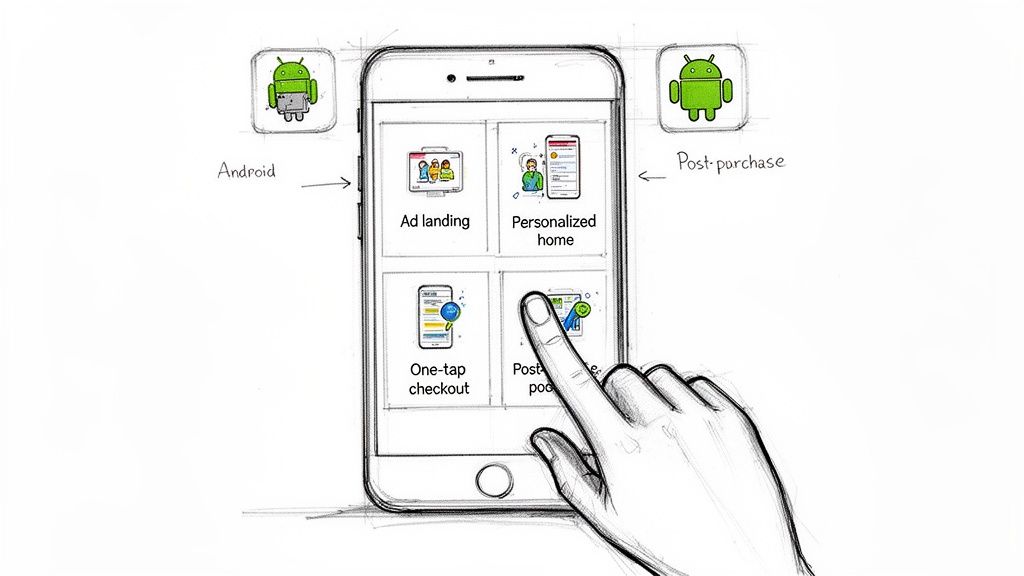
- Device-Specific Banners: Running a sale on a new iPhone case? Show that banner only to iOS visitors. Serve a different offer to Android users.
- Geotargeted Content: Show winter coats to shoppers in cold climates while highlighting swimsuits for visitors in warm regions.
- Segment-Based Navigation: Dynamically reorder your mobile menu. Place "New Arrivals" at the top for returning customers, and "Best Sellers" for first-time visitors.
Building a Testing System That Compounds
A brilliant personalization strategy is just an idea until you build a system to execute, measure, and iterate on it. The brands that win aren't running random one-off tests. They're building a compounding program where each test informs the next.
At Convertibles, our CRO testing programs follow a systematic approach: identify a high-leverage segment, design a personalized experience for that segment, test it rigorously, and then move to the next opportunity. The cumulative impact of validated wins is what separates fast-growing brands from those still running generic, site-wide tests that barely move the needle.
The Compounding Effect in Practice
Here's what a systematic personalization program looks like over a quarter, using real test results from our clients:
| Month | Test Focus | Segment | Monthly Revenue Lift |
|---|---|---|---|
| Month 1 | Homepage storytelling module | New visitors | +$130,251 |
| Month 1 | Popup offer format | New email subscribers | +$45,000 |
| Month 2 | Visual mega menu | Mobile discovery shoppers | +$43,544 |
| Month 2 | Cart drawer free gift messaging | Active cart users | +$50,099 |
| Month 3 | Collection page category portals | Browsing shoppers | +$240,000* |
| Month 3 | Device-specific press section | Desktop vs. mobile | +A$9,392 |
*$8,000/day annualized to monthly
No single test is a silver bullet. But a disciplined program running 2-4 targeted tests per month creates compounding revenue gains that generic CRO programs simply cannot match.
Where to Start: Three Quick Wins
Instead of trying to personalize everything at once, focus on these high-leverage starting points:
- Audit Ad-to-Site Continuity: Review your top 5 paid ad campaigns. Does the landing page experience match the ad's promise? If not, create dedicated landing pages that mirror the ad's creative and messaging. This is often the lowest-hanging fruit for improving ROAS.
- Implement Segmented Welcome Offers: Test different popup offers based on traffic source. Offer a dollar-off discount to price-sensitive Facebook traffic while offering free shipping on orders over a threshold to high-intent Google search traffic.
- Personalize for Returning Customers: Greet returning, non-purchasing visitors with a homepage banner that showcases "New Arrivals" or "Back in Stock" items related to their browsing history. This simple acknowledgment can significantly increase engagement and conversion for this valuable segment.
Frequently Asked Questions
How Is a Customer Journey Map Different from a Sales Funnel?
A sales funnel is a one-way, top-down view that tracks people from one step to the next (add to cart, checkout, purchase) and sees every customer as basically the same. A customer journey map is built around the customer's perspective. It's not a straight line. It tracks the entire experience across touchpoints (ads, email, website, social) and shows how different segments take different paths. That's why it's the foundation for personalization: you need to understand that your VIP takes a completely different route through your store than a first-time TikTok visitor.
What Are the Most Important Metrics to Track?
The most successful brands focus on three core metrics that measure the health of their customer journey:
- Profit Per Visitor (PPV): The ultimate metric. It blends your AOV, conversion rate, and margins into one number that tells you how much actual profit each visitor generates. This is what we optimize for in every Shopify conversion rate optimization program.
- Customer Lifetime Value (CLV): The total revenue a customer generates over their entire relationship with you. When CLV is climbing, your retention efforts are working. See our full guide on improving customer lifetime value.
- Segment-Specific Conversion Rate: Stop looking at one conversion rate for your whole site. Break it down: how does "New Visitors from TikTok" compare to "Returning VIP Customers"? The gaps reveal your biggest opportunities.
How Long Does It Take to See Results from Personalization?
A focused test on a high-traffic segment can produce measurable results in 14-21 days. But the real value isn't in one-off wins. It's the compounding effect of consistently launching 2-4 targeted experiences every month. The cumulative impact of validated improvements is what drives long-term profit growth. To understand the mechanics of how to build this kind of program, see our guide on building a CRO testing program for Shopify.
What's the Biggest Mistake Brands Make with Journey Mapping?
Creating a detailed journey map and then letting it collect dust. A journey map isn't wall art. It should directly generate your next three months of testing hypotheses, with each test tied to improving a specific touchpoint for a specific segment. For deeper insight into understanding how users interact with your site at a behavioral level, explore our guide on behavioral segmentation.
Your customer journey map fails the moment it stops being an action plan. It should be the direct source for your next quarter of personalization tests, with each hypothesis tied to a specific segment and touchpoint.
How Do I Know If My Segments Are Too Broad or Too Narrow?
A segment is too broad if the people within it have meaningfully different buying motivations (for example, "all new visitors" includes bargain hunters and luxury buyers). A segment is too narrow if you can't get enough traffic to reach statistical significance in a test within 2-3 weeks. Start with 3-5 segments based on behavioral data, test against them, and refine as you gather data on which distinctions actually affect purchasing behavior.
At CONVERTIBLES, we build systematic personalization programs that turn customer journey insights into compounding revenue for 8 and 9-figure Shopify brands. If you're ready to move beyond generic CRO and unlock profit from your existing traffic, book a free strategy call and we'll map your highest-impact opportunities.